- TastyType
- Posts
- #31 – Style over substance
#31 – Style over substance
Elegant typefaces that add flair to your designs.
Jord Riekwel
February 14, 2024

I just love sans serif typefaces; I use them in 99% of the logo designs for my clients. Sometimes however I wish I could play around with completely different fonts… My current projects don’t need something more stylish, but if they did I would be taking a good look at the typefaces below.
Elegant Typefaces

This typeface has everything: gorgeous weights from thin to black with stunning italics. But also many OpenType features such as ligatures, stylistic alternates, superscript, and much more. Perfect for any branding or magazine work that needs a bit of style.

I admit that this one is technically a sans serif, but it feels different. It looks like it’s cut out in marble, over a thousand years ago, or painted on the signage of the best Parisian bakery. It simply demands attention and respect. (Or am I reading too much into it like some type-loving dork?).
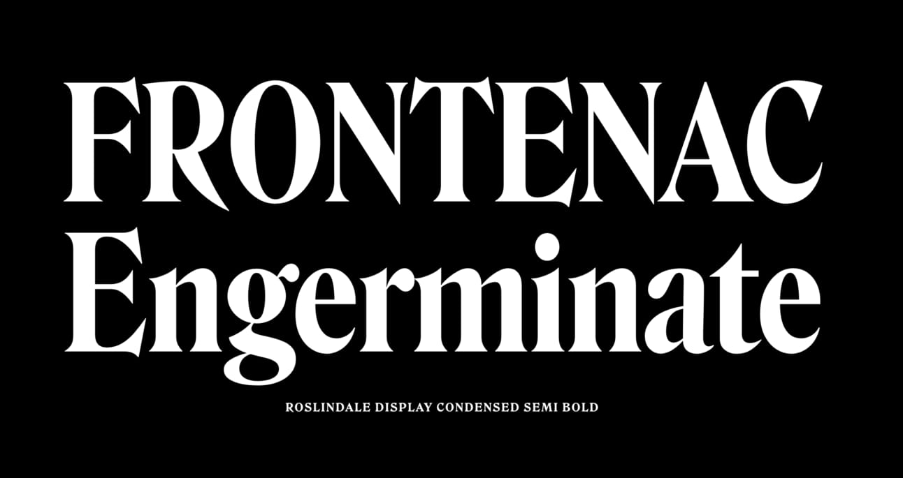
It’s tall, bold, and sharp, not unlike your favorite Knives Out character, the movie that embodied the return of this style. Based on the serif typefaces from the 1890’s Roslindale has everything you might need in 2024.

If you like confident curves with a flamboyant personality then boy do I have a typeface for you. It comes with an obscene amount of decorative ligatures and alternative glyphs. I feel like starting a skin care routine and launching my own brand of products.

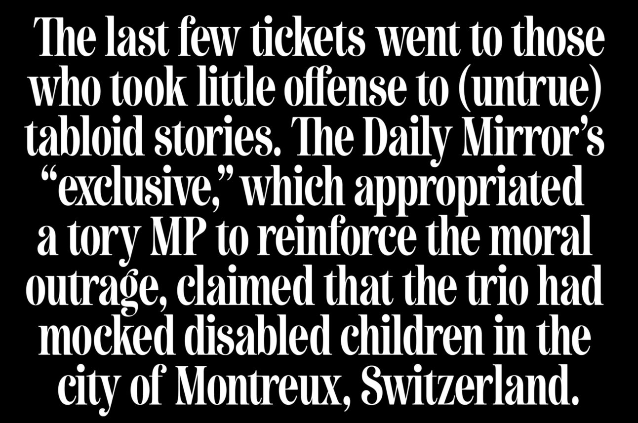
It should come as no surprise that Larken has been a top seller since 2020. I feel like it deserves even more attention. This confident typeface is not just pretty, but also very pragmatic. Great to look at, but also very pleasant to just read for longer copy. Takes your visual communication to the next level.
Inspired by shout-y tabloid headlines, Newsagent can be yours for a little over 30 bucks. The only downside is that it only comes in a single weight. But then again, there’s power in doing one thing only, and doing it well.

If it wasn’t for the imposter syndrome, I would love to design some branding for healthcare products. Povetarac would be my first pick to experiment with. It just breathes style, confidence, and experience. (F37 Bergman would by my second pick.)

Nicky Laatz makes some of the best typefaces. She always manages to nail the right style. This one sure hits all the nostalgia buttons, and only costs 30 bucks for 20 different weights. If I was an influencer I’d be all over this one. Her typeface Awesome Serif is equally… awesome.
Interesting links
TOOL — Font Pairing Generator
The End
Thanks for reading! Hope you enjoyed the theme of this newsletter. I’ll be doing more of these in the future. If you’d like me to cover a specific style, send me a message.
If you have any other feedback, critique, or compliments, let me know. 👋