- TastyType
- Posts
- TastyType #27 – Feast Your Eyes on These
TastyType #27 – Feast Your Eyes on These
Ten distinct typefaces to take your design to the next level
Jord Riekwel
March 08, 2023

As a logo designer I use fonts to add the right character and feel to the branding. I’m always hunting for new and unique typefaces to add to my collection.
I enjoy sharing my finds on TastyType and for this week I’ve handpicked ten typeface with a very distinct look. These fonts can be the metaphorical rug that truly ties your design together.
The Goods
Do you want your design to stand out? Look no further than Gradient. It’s fun yet clean, with a dash of retro vibes. Good stuff.
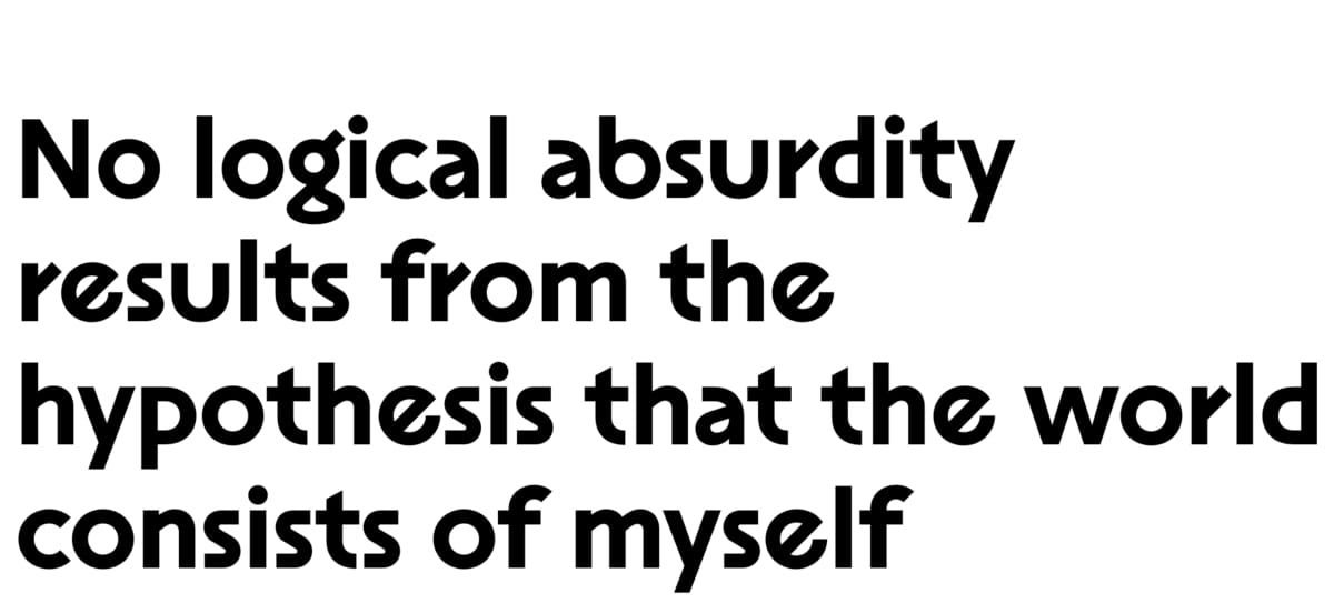
This typeface is as mind-bending as it's website. The first ever typeface I’ve seen that comes with ritalics. Curious what those are? Check the website. Plantar is futuristic, utilitarian, and so so clean. One of my favourite this year for sure.
This is what you get when a child’s writing is used to create a grotesque typeface, quite literally. It’s a mere ten bucks on Gumroad with the only downside being that it seems to only come in one weight.

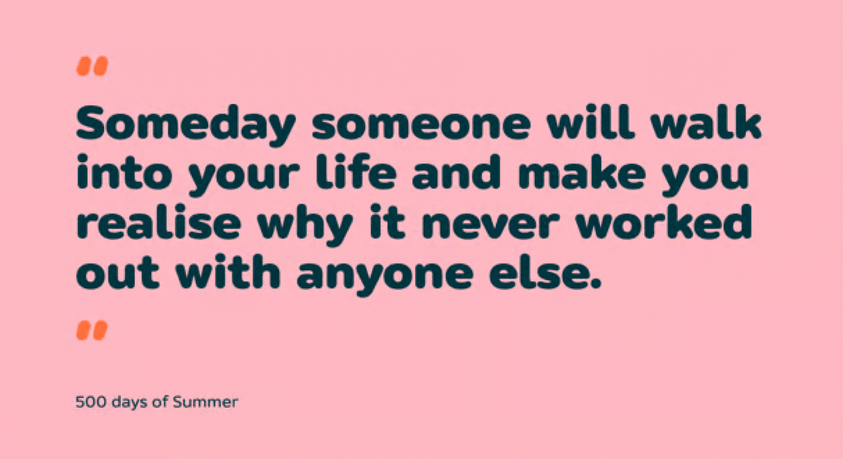
Look, ignore those cookies for now and focus on this fun and lively typeface that’s going to take any branding to the next level. Now please excuse my as I try to figure out how to open my own ice cream salon as a reason to use this font…

I love it when a typeface gives me options. As you can see Schrifted Sans gives you plenty of variations for almost every aspect of the typeface. The logo design in me gets all giddy over stuff like this, as if I’m customizing my character in The Sims 4.
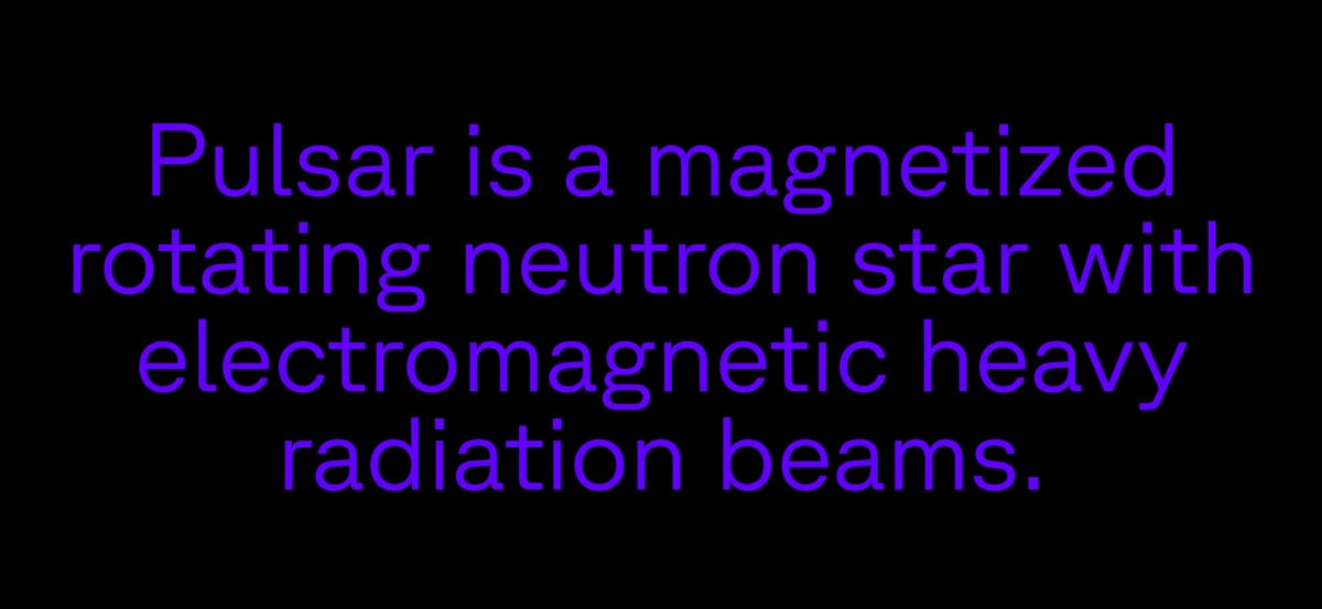
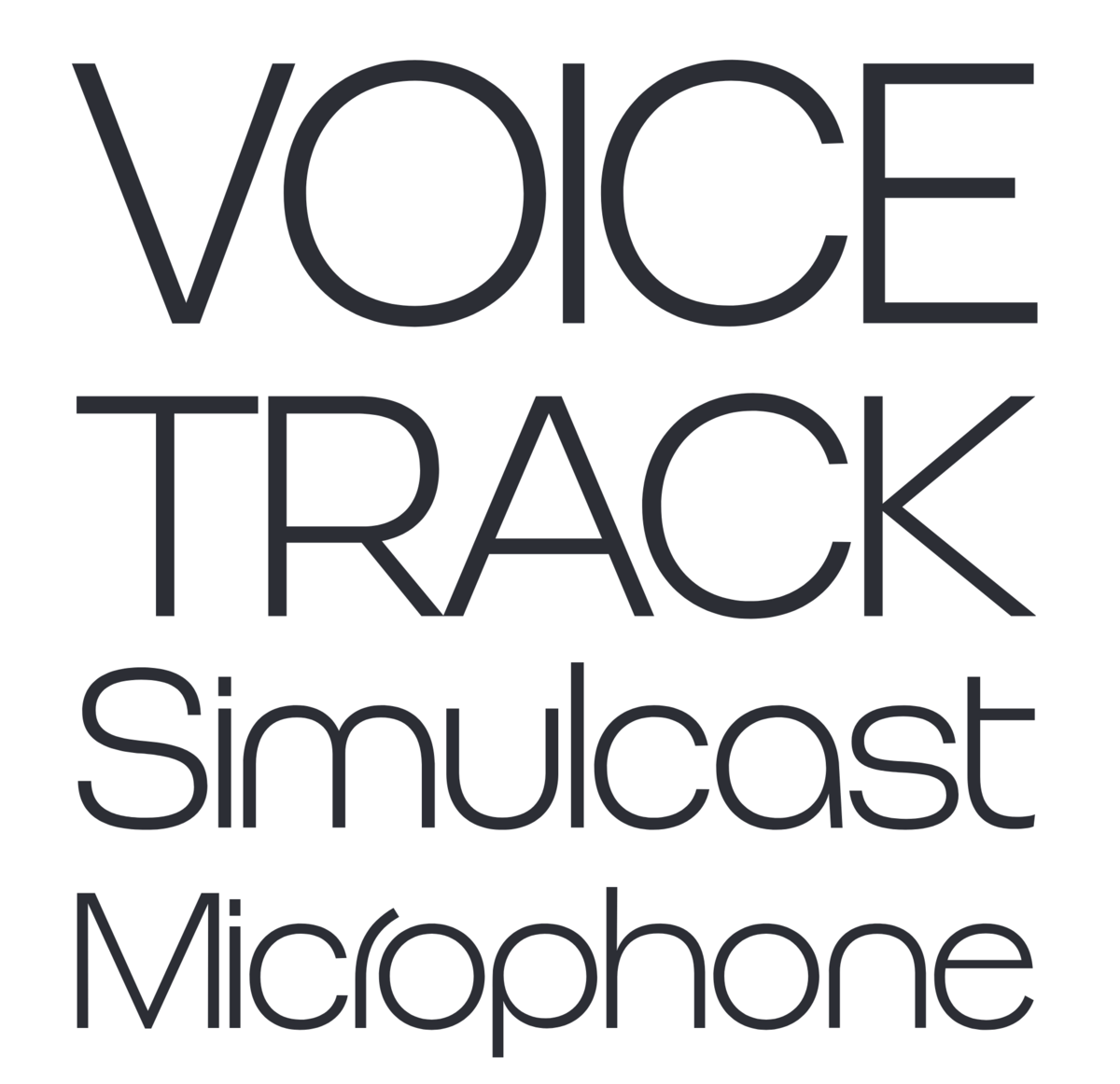
Let me show you Rooftop as a little pallet cleanser; a brutalist take on the American-styled grotesks. Sturdy, techy, and great for both branding and body copy. It’s also available in a mono version.
Puck
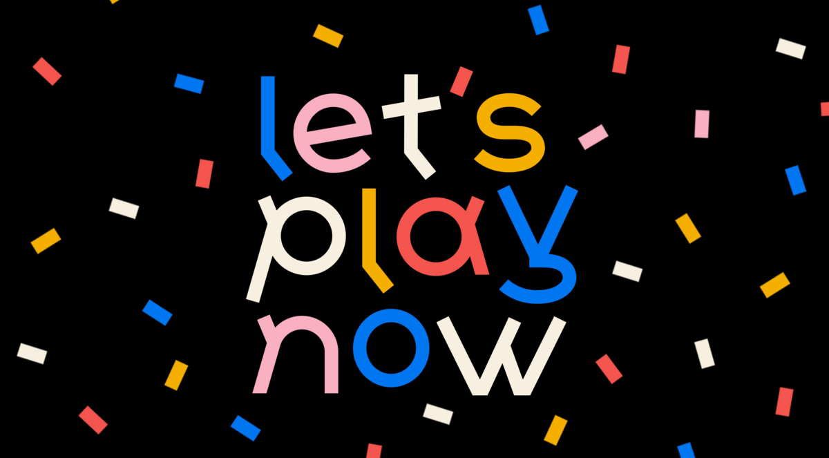
Said it before and will say it again: no issue of this newsletter is complete without the inclusion of at least one rounded typeface. Don’t let this preview fool you, the weights and style of this typeface are diverse and suitable for many applications, not just fresh juice brands.
This is a display font with fun retro touches that stands out just enough to be different, without being too distracting. Great for any design use honestly where you just want to be a bit different. It shows that you care about the design, since you don’t pick a font like this on accident.

As a famous person once said, “why so serious?” Life can get pretty dull, why not spice it up with a bit of 90’s cartoon playfulness? Oh, and it comes in at a mere $55 for 14 weights.
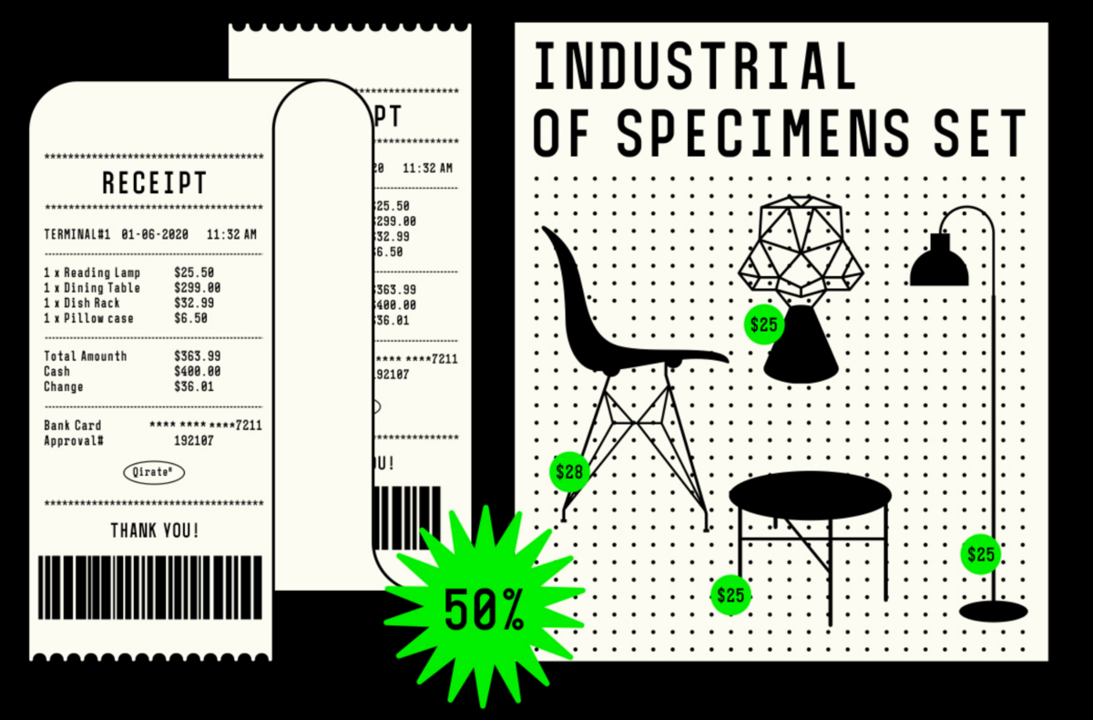
I don’t get a lot of project that end up utilizing mono typefaces in the branding. A shame really because it can look so good.
That’s it, you made it to the end, you legend. 😉
Can you keep a secret? Next time I’ll share my top 15 favorite typefaces…
As usual, @ me if you’ve got any feedback, questions, requests, etc.
With ❤️ from 🇳🇱